The Movie Game
A fast-paced party game rebuilt as a polished digital product in one day.
Overview
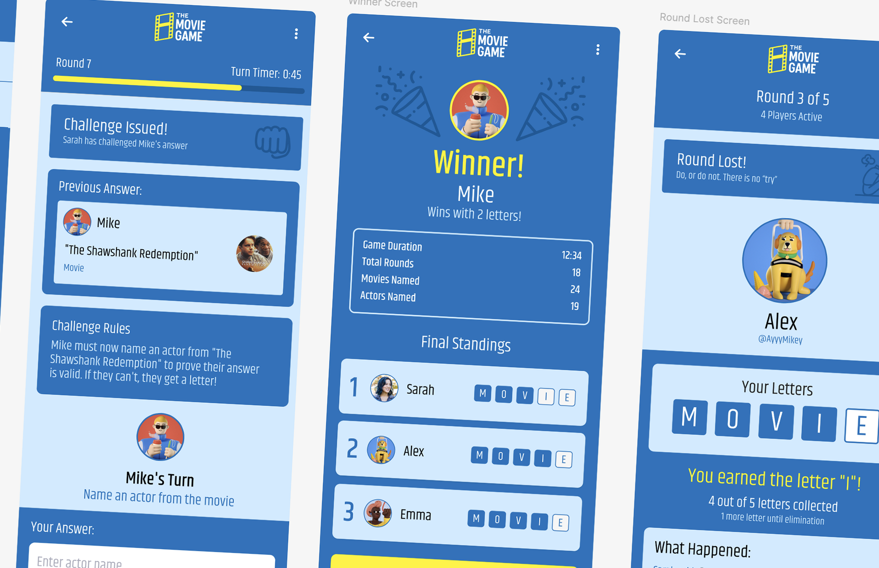
The Movie Game is a digital spin on a party game I've played with friends for years: players take turns naming actors and movies, chaining connections back and forth as fast as they can until someone stalls out. Miss a beat and you earn a letter; collect all five (spelling M-O-V-I-E) and you're eliminated. This POC set out to capture that same fast, competitive, slightly chaotic energy in a polished mobile product, and to test how far AI tools could push a solo design sprint without sacrificing craft.
A year later, this POC became a real product. See how it grew into Late Fees, a live multiplayer game my friends play every week.
Challenge
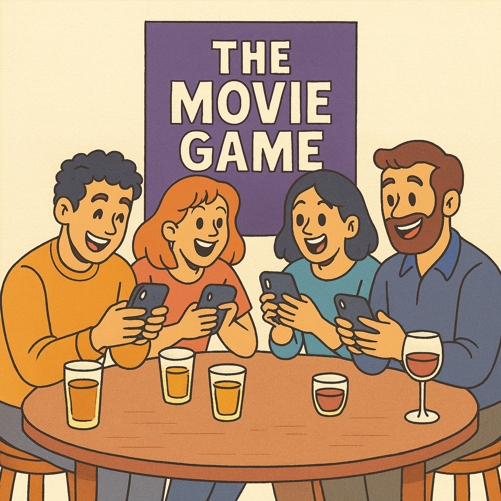
Movie Game is a verbal, social game with no board, no cards, and no fixed structure beyond the rules everyone half-remembers. Turning that into a smooth digital flow meant solving problems the tabletop version never had: how to keep score fairly, enforce turn order, time each answer, and handle disputes over a questionable answer, all without breaking the pace that makes the game fun. On top of that product problem, I set a personal constraint: design and prototype the whole thing in a single workday, leaning on AI tools wherever they could speed up ideation, wireframing, and asset creation, while still landing on screens I'd be proud to put in a portfolio.
Process & Solution
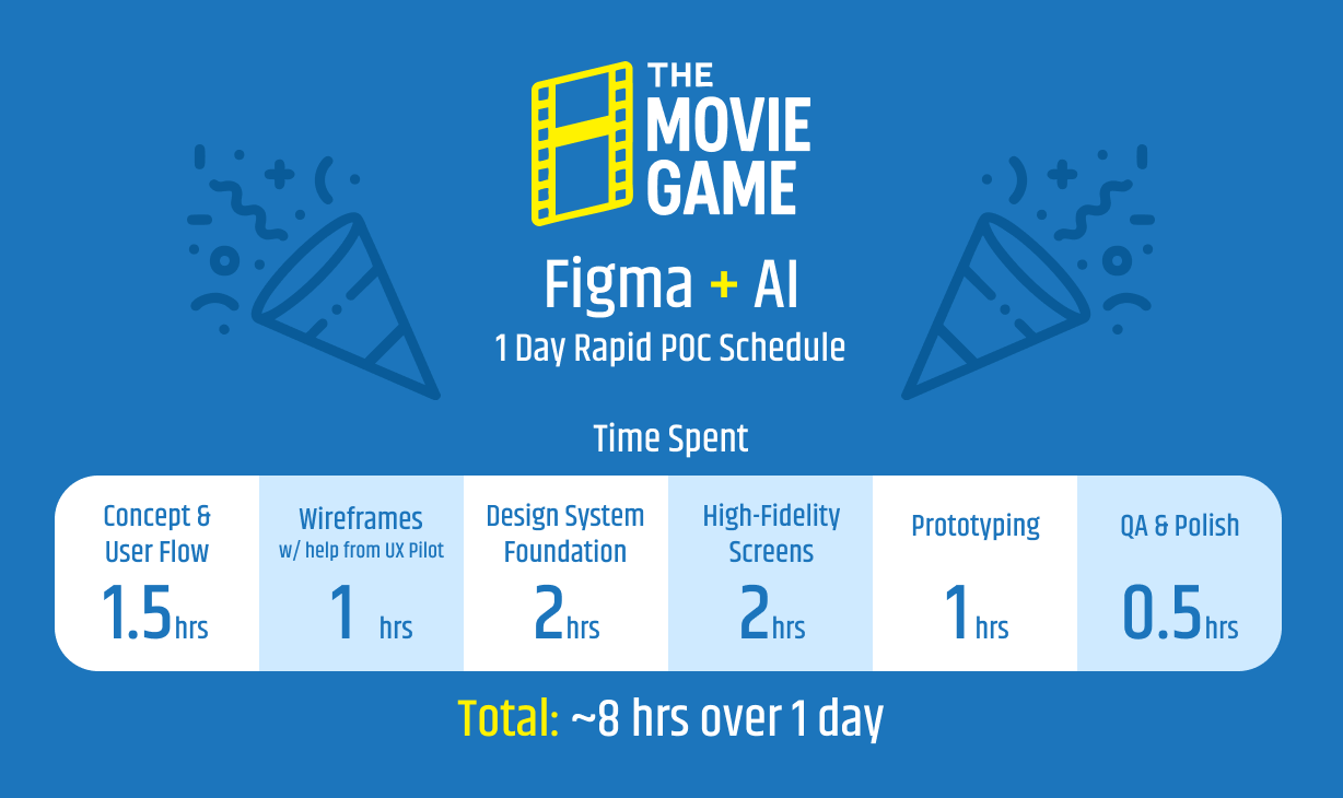
The sprint. I timeboxed the day into six stages, from initial concept through QA and polish, and tracked time spent against each one as I went. Concept and user flow took the first ninety minutes, wireframes came together in about an hour with help from an AI wireframing tool, and the rest of the day split between building a small design system, producing high-fidelity screens, and prototyping the full flow in Figma.
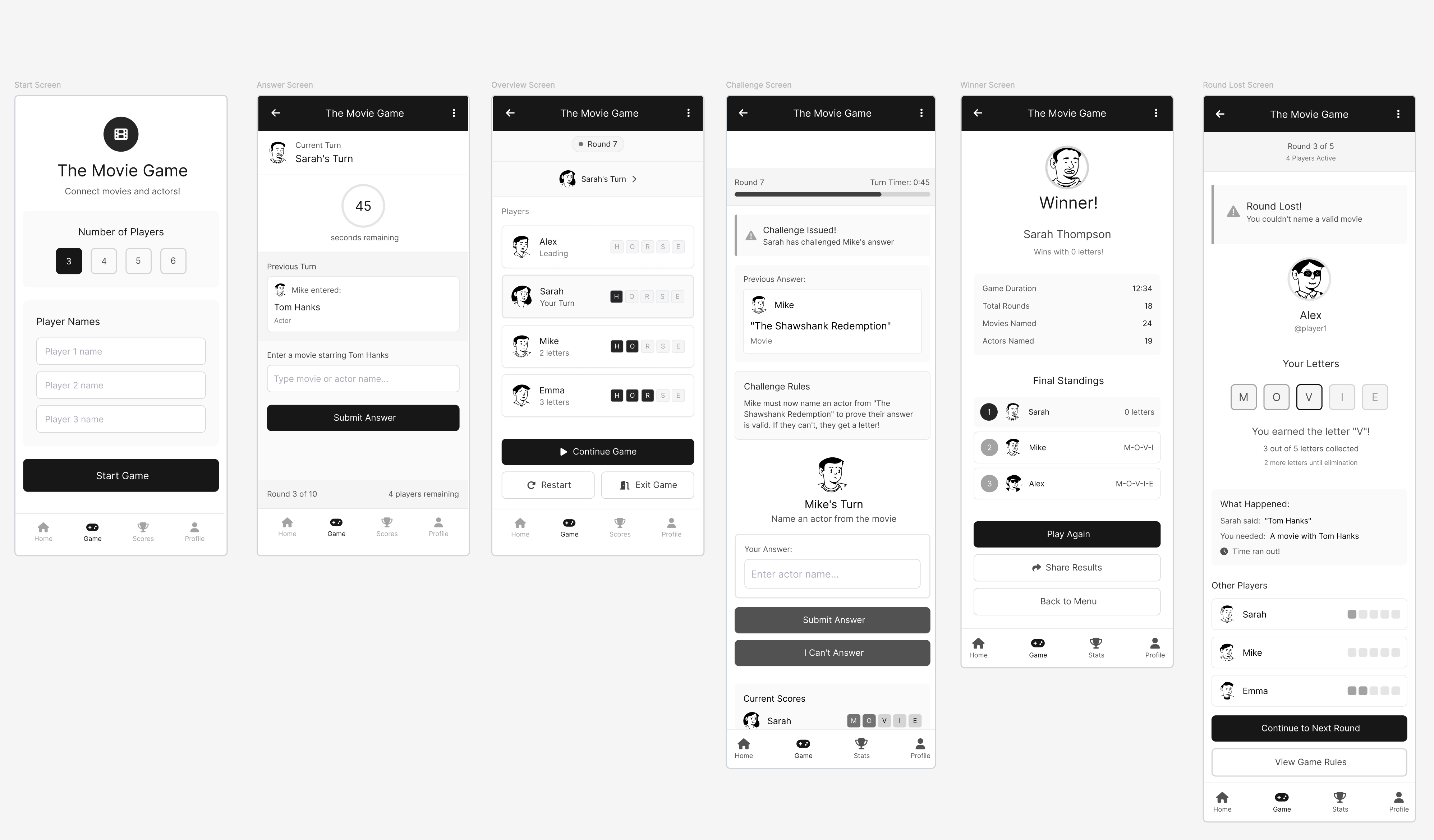
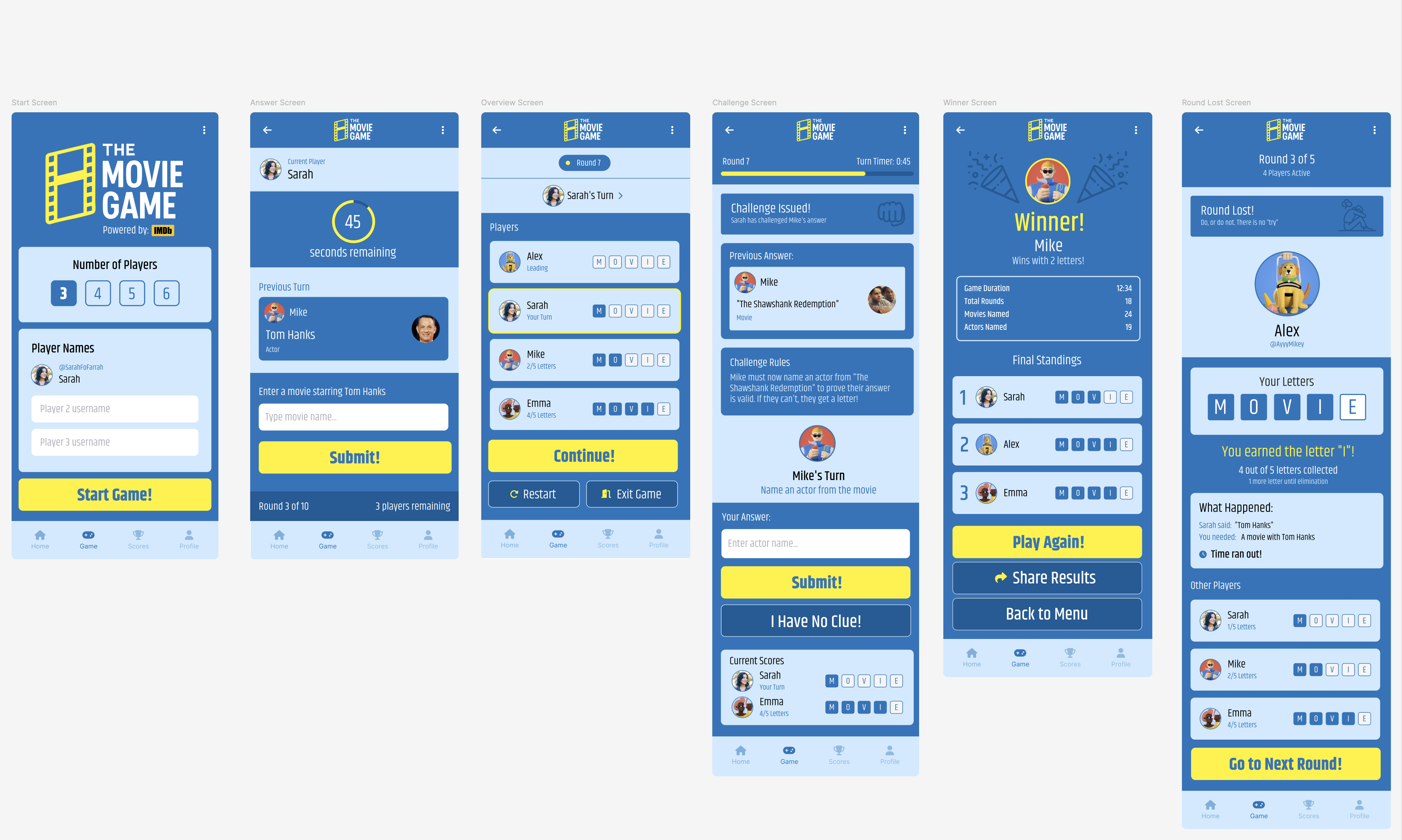
Mapping the flow. Before touching visual design, I worked through the core game loop and its edge cases: what happens when a player can't answer, when someone challenges an answer, when a round ends, when the game ends entirely. AI-assisted wireframing let me move quickly from that flow to low-fidelity screens, so I could test the structure, start screen, answer screen, round overview, challenge screen, winner screen, and a round-lost state, before investing any time in visual style.
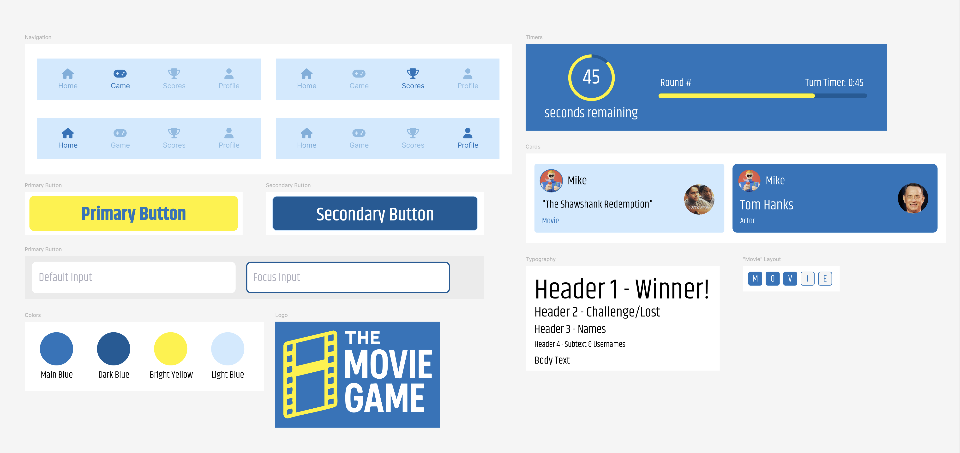
Building a design system. With the flow validated, I built a lightweight component library and style foundation: navigation states, primary and secondary buttons, input states, a color palette (a confident blue paired with a bright, competitive yellow), a typography scale, and the player and movie/actor "cards" used throughout the game. Establishing this system early meant every later screen could be assembled from parts instead of designed from scratch, which mattered a lot given the time budget.
High-fidelity screens. I carried the wireframed flow into full color, layering in the details that make the game feel alive: a countdown ring for the turn timer, progress bars, avatar-driven player cards, and a letter tracker that shows how close each player is to elimination. The challenge flow, where one player can dispute another's answer, got particular attention, since it's the moment with the most social tension in the physical game and needed to read as fair and clear on screen.
Impact
- Delivered a full user flow, design system, and high-fidelity prototype in a single workday
- Validated that AI-assisted wireframing and ideation can meaningfully compress early-stage design time without sacrificing quality
- Produced a clickable Figma prototype ready for user testing and further iteration
- Demonstrated a repeatable rapid-POC process suited to future concept work
Deliverables
- User flow and edge-case mapping
- AI-assisted low-fidelity wireframes
- Lightweight design system (color, type, components)
- High-fidelity mobile screens
- Clickable Figma prototype