Late Fees
From an eight-hour Figma concept to a live multiplayer party game my friends play every week.
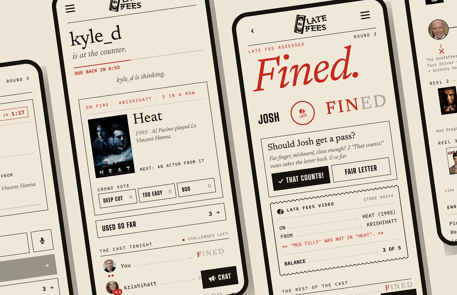
Overview
In September 2025 I designed The Movie Game in a single eight-hour sprint. It was a clickable Figma prototype of a party game my friends and I have played out loud for years: one person names a movie, the next names an actor in it, the next names another movie that actor was in, and so on until somebody stalls. It looked good. It also skipped every question that mattered. Can a phone actually check an answer? Can you keep a fair score across five phones? Can an app hold the energy of a room?
Late Fees is the answer. It's a live, installable, multiplayer web app that my friends play together every week at latefees.app. Name the picture, name who's in it, and return it on time. Stall, miss, or get caught bluffing and you're charged a letter. Spell F-I-N-E-D and you're out.
I owned everything except writing the code by hand: product strategy, UX, UI, brand, voice, game design, playtesting and QA. I built it with Claude Code as my engineering partner. I designed every screen and system, set the rules and made every call. The AI wrote and tested the code to that spec, under guardrails I designed.
- From the first live version to the latest release, shipped between game nights
- 6 wks
- Games played by real friends (old games are cleaned up automatically, so this undercounts)
- 102
- Chat messages sent during games
- 853
- Picks in the longest reel ever played
- 52
- Automated regression tests, run before every deploy
- 178
- Commits across 16 build days
- 155
Challenge
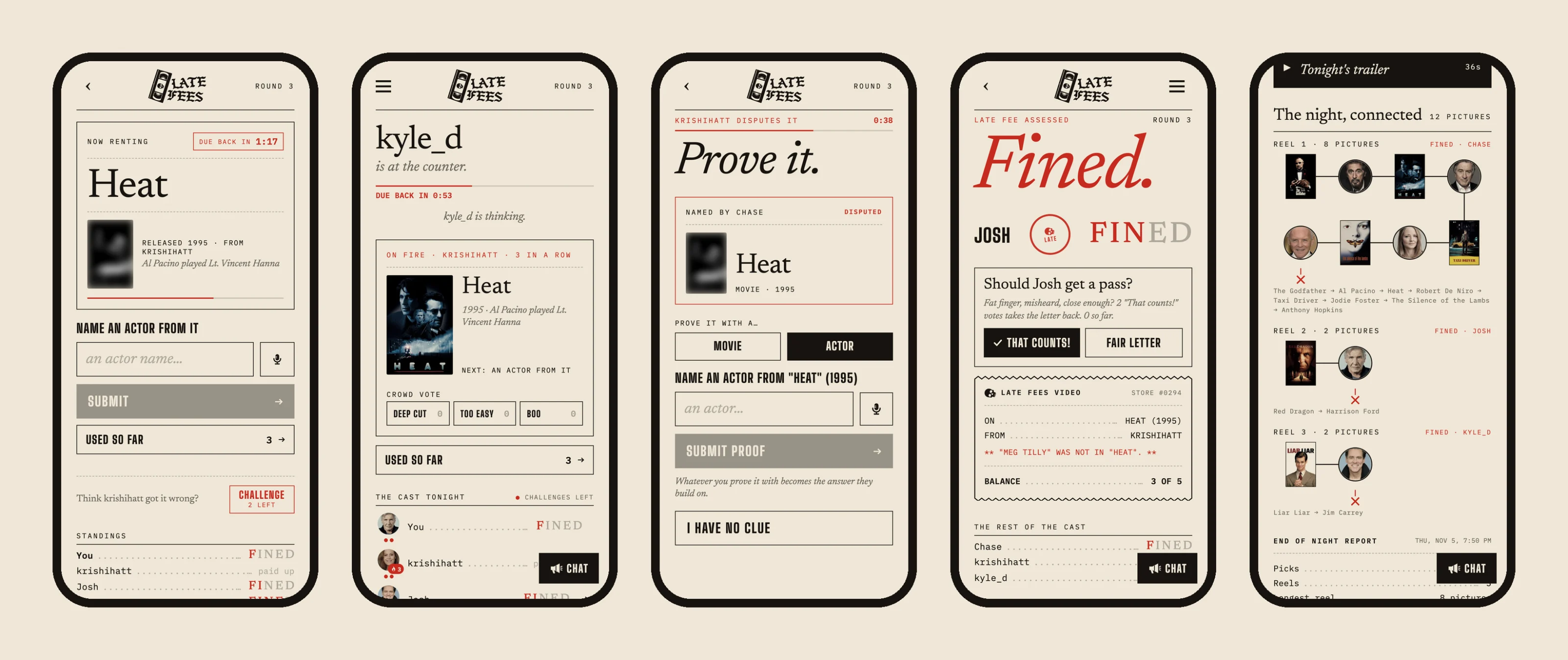
A prototype is a picture of a game. The real test was a living room full of friends arguing over whether Kathy Bates was in Mary Reilly. Moving from screens to a product meant solving problems the POC never had to face:
- Truth. Every answer has to be checked against real movie data, instantly, on a phone, and forgive typos without letting bluffs through.
- Fairness. One wrong "you're wrong" ruins the night. The app has to be trusted more than the friend who swears he's right.
- Pace. Party games die when someone stalls. Five phones have to feel like one room.
- Platform. It's a web app on iPhones, which means separate logins for Safari and the home-screen app, push alerts only after an install, and icons that never update.
- Identity. Within the first week I found an App Store game already using our name and vocabulary. The product needed a brand of its own, fast.
The brief I wrote for myself held one line above everything else: "The game should feel like a verbal party game first, app second. Reduce friction at all costs."
Process & Solution
- Sept 2025The Movie Game POCEight hours in Figma: six screens, a blue-and-yellow system, M-O-V-I-E. The core loop and the challenge as the moment of tension carried straight into the product.
- Sept 18First live versionOnline multiplayer on everyone’s own phone, real movie data, sign-in. The first game night broke it immediately, and the fixes started that night.
- Sept 24The 14-feature day, and a new nameOne planned day turned a working game into a platform: Daily Challenge, stats, teams, push alerts, a TV board, Hardcore mode. The same day, The REAL Movie Game became Late Fees.
- Oct 1Trust, compliance, and Fright MonthPrivacy, terms, account deletion and a public front page earned Google’s sign-in branding approval. A full Halloween theme shipped the next day.
- Oct 8The big playtest batchPoster blur, Nudge, twists, crowd votes, game chat, join-in-progress by vote: every one of them came from something that happened at the table.
- Oct 14Fairness work“Did you mean…?”, the miss log, “That counts!”, and an AI answer-auditor that turns disputed answers into permanent tests.
- Oct 21House StyleA ground-up redesign: the app as the counter of an old video store. 13 screens redrawn by hand, about 20 more restyled automatically by a theme engine.
- Nov 1The wow layerTonight’s trailer, The night connected, Hot streaks and Champion of the week, all shipped in one day.
Playtest, batch, ship
The process was simple and relentless. We played on real game nights. I collected bugs and ideas in batches. Every change went fix, deploy, verify live, commit, and production deploys waited until nobody was mid-game. Many of the best features weren't mine. Hardcore mode was a friend's idea and is credited by name in the rules. Inventory started as a friend's sketch. "Whoever stumped the loser starts the next reel" and the challenge limit both came out of arguments at the table. My job was to hear the argument underneath the complaint and design the system that settled it.
Fairness is the product
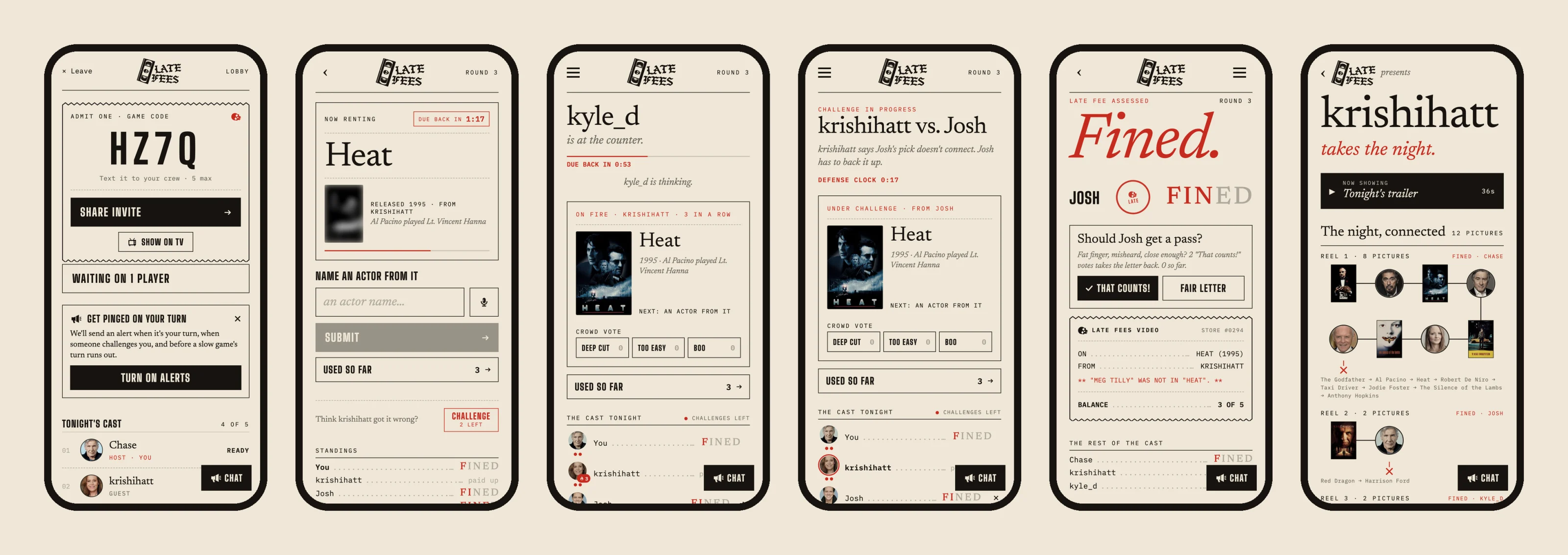
The biggest lesson from playtesting: a wrong rejection is worse than a missed cheat. A bluff that slips through gets laughed about. A correct answer marked wrong ends the night. So I designed fairness as a system, in layers:
- A forgiving matching engine. It forgives typos scaled to the length of the name, dropped subtitles ("Last Crusade"), missing hyphens, number words, sound-alike misspellings ("The Oddessy") and words run together. It also refuses false friends: "the martian" must never snap to The Date.
- "Did you mean…?" On a near miss, the app offers the closest valid answer from the actual cast or filmography. Tap yes and you're safe. Tap no and you take the letter.
- "That counts!" After a plain miss, the rest of the table votes. A majority takes the letter back and can even un-eliminate the player. It's a pardon, not a do-over, so the reel still ends.
- No unfair letters. If the movie database is down or a house rule slipped, the app warns instead of fining.
- A miss log that feeds itself. Every rejection is recorded. A report script re-checks each one, and an AI answer-auditor sorts them into real misses, matching gaps and data gaps. Every confirmed gap becomes a permanent regression test in a 178-test suite that runs before every deploy.
The challenge, rebuilt as an economy
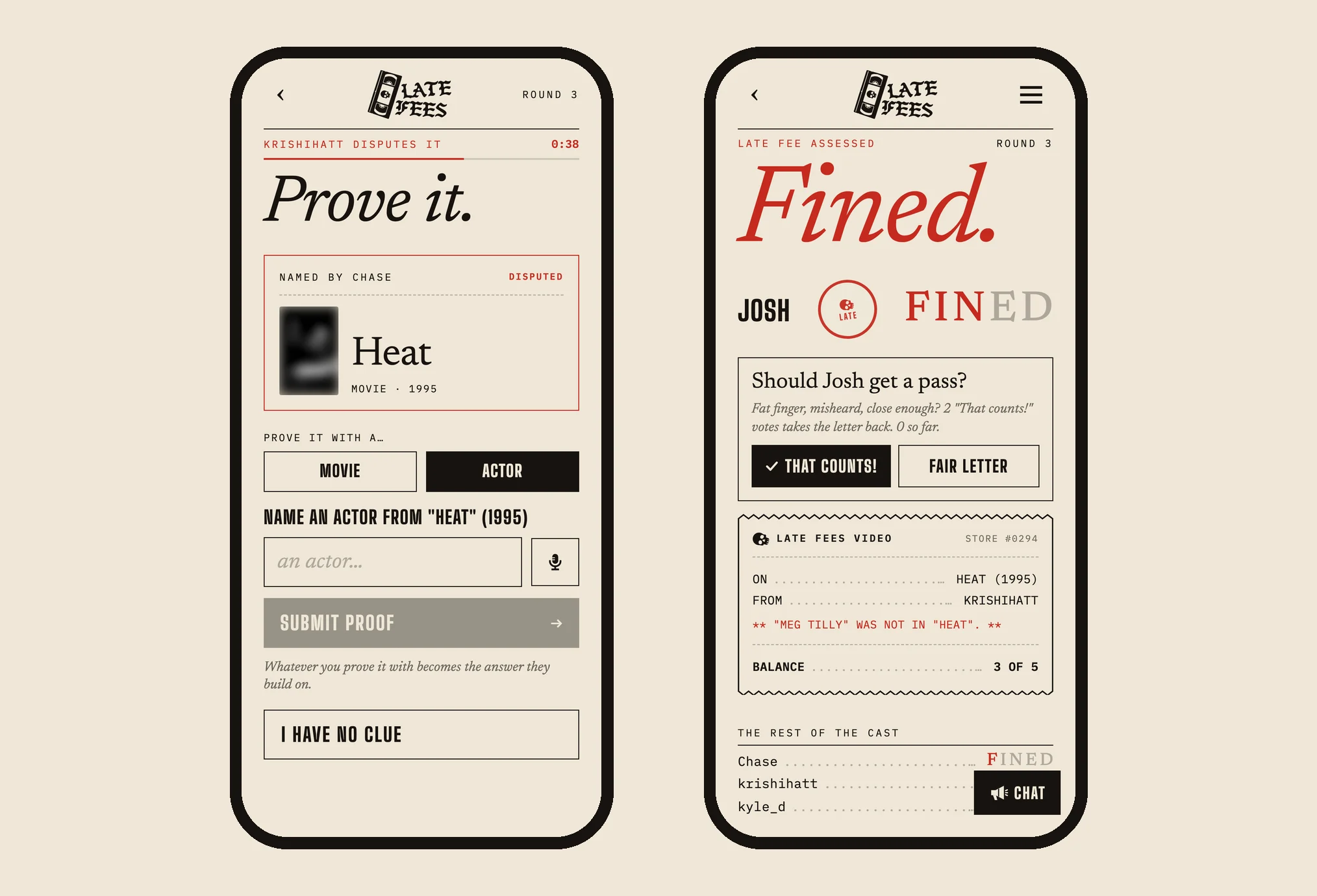
The challenge was the POC's best idea: the moment you call someone's bluff. In real play it needed rules. A successful defense makes the proof the new answer, so the game keeps moving instead of resetting. Challenges are a limited resource: two each, returned when they work, with one earned back every five right answers, so bluff-calling stays a strategy rather than spam. The button says you're out before you tap it. And only the two players in the dispute go to the Challenge screen, while everyone else stays on the board and watches the defense clock run.
Designing for the table, not the screen
The features I'm proudest of are about people in a room:
- Poster blur. Cast names are printed on movie posters, so whoever has to name an actor sees the poster blurred everywhere.
- Pace pressure. A visible "due back" clock, a live "kyle_d is thinking…" line, a turn chime, and a Nudge: a red pointing hand that sends a push to whoever's stalling.
- Catch-up lifelines. Your first letter earns one use of Hot potato (pass the turn with half a clock) or Phone a friend (a random player gets 15 seconds on their phone to save you).
- Classic first. Playtests showed that new players wanted the plain game. So games start Classic, and Bounty, Deep cuts and the rest live behind one Party Mode switch.
The rename that became the identity
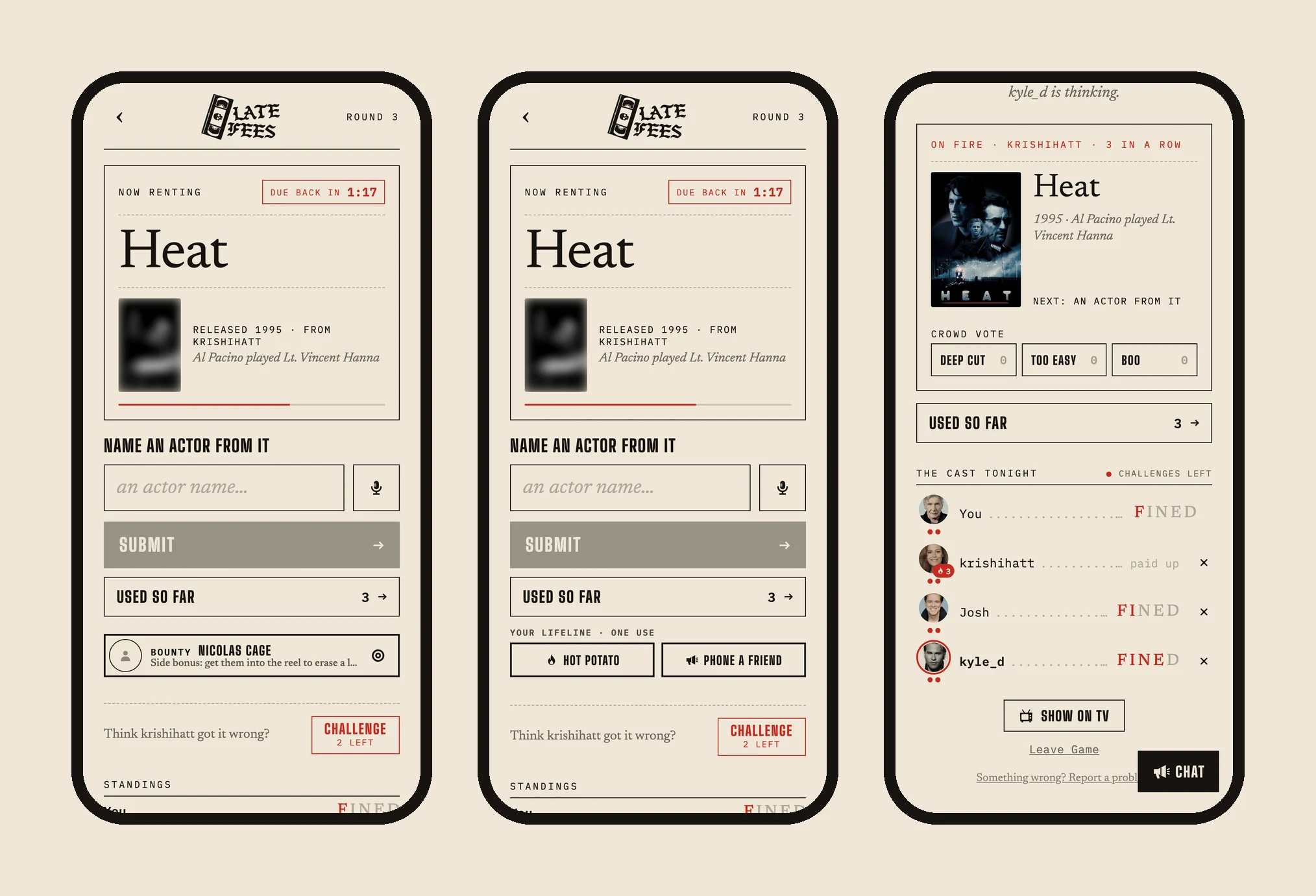
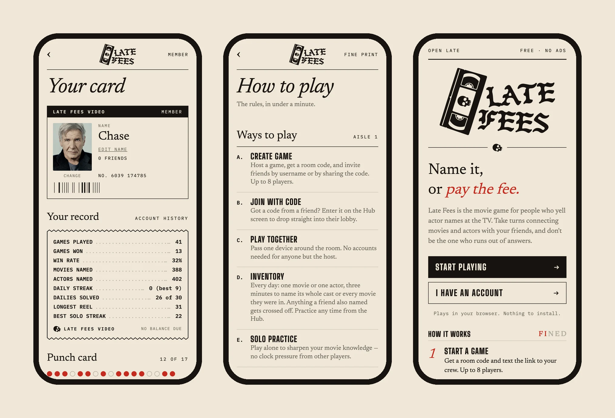
Finding a competitor with our name could have been a setback. Instead it became the brief for the whole brand. Late Fees is a punk, DIY video store with a VHS tape and a skull for a logo. The vocabulary became UX: the sequence is a reel, its items are picks, strikes are late fees, and losing spells F-I-N-E-D. The turn timer reads "Due back in 1:17." Whoever's up "is at the counter." Every fine prints a rental receipt. Your profile is a membership card with a barcode and a punch card.
Copy does real work here, too. "Think krishihatt got it wrong? Challenge · 2 left" explains a rule, shows a resource and makes a dare in one line. "Whatever you prove it with becomes the answer they build on" teaches the challenge mechanic at the exact moment it matters.
Tearing down my own design
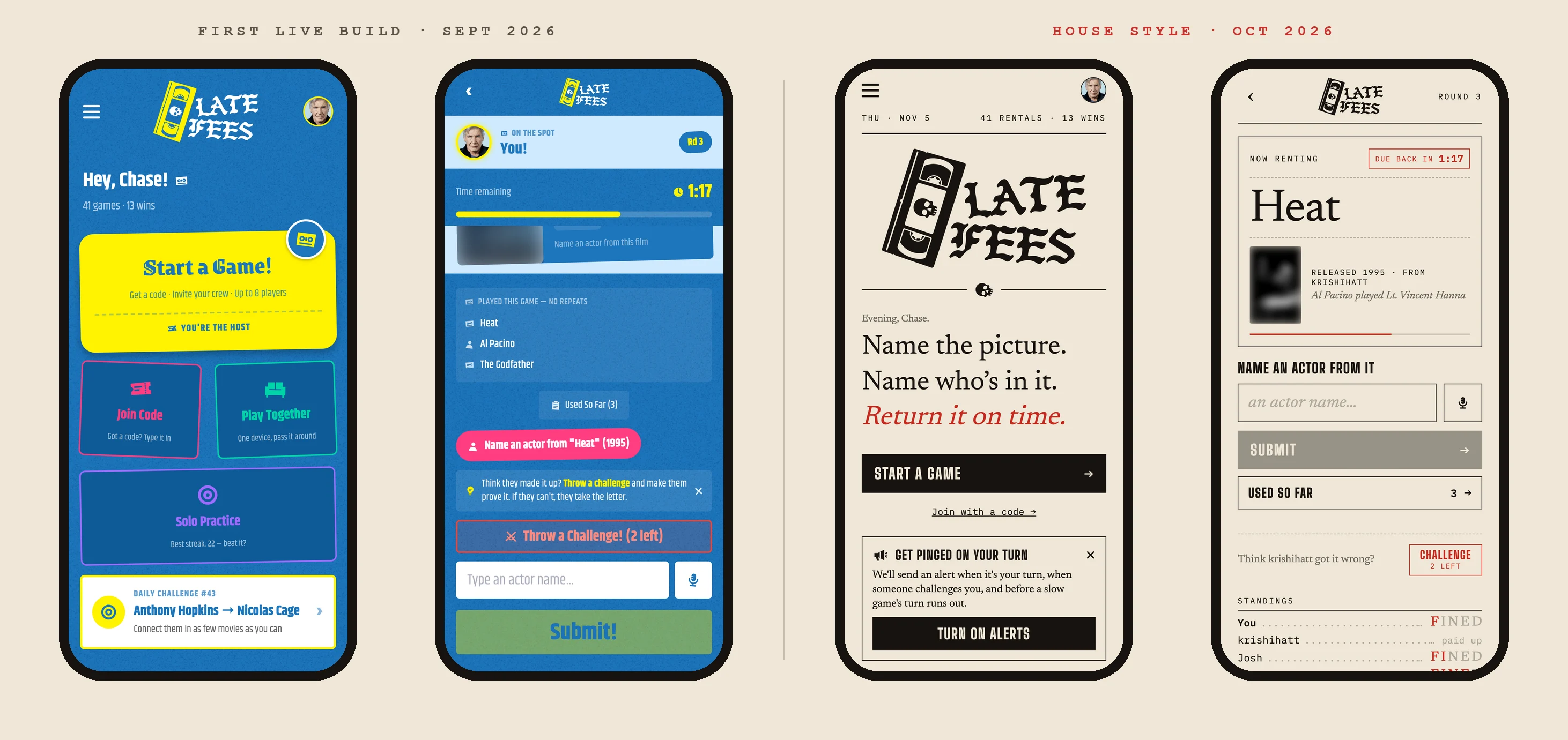
The first live version wore the POC's blue and yellow. It was fun, but it was loud: tilted ticket cards, a tile grid, a scrolling marquee. A month in, I tore it down and built House Style from the brand instead of decorating on top of it. I tested several visual directions side by side as live options in a separate design lab before anything touched production.
- Palette: flat paper, ink and late-fee red. Nothing else.
- Rules: no textures, no rounded corners, no tilts. Hierarchy comes from type and rules (lines) only.
- Type: Newsreader serif for headlines, Big Shoulders for buttons and labels, IBM Plex Mono for receipts and data. The blackletter VHS-skull logo is the only ornament.
- Photos are tinted toward the paper with an SVG color matrix, so posters and headshots sit in the print world. Safari drops CSS blend modes, so the matrix was the answer that worked in every browser.
The hard part was shipping it without breaking a live game. I redrew the 13 core screens by hand. The other ~20 are restyled automatically by a theme engine that reads each old style by its role: a blue page becomes paper, a yellow button becomes ink, a small bold label becomes mono uppercase. Game logic lives in shared hooks, so both looks always behave identically, and the old look is still one line away.
One system, three moods
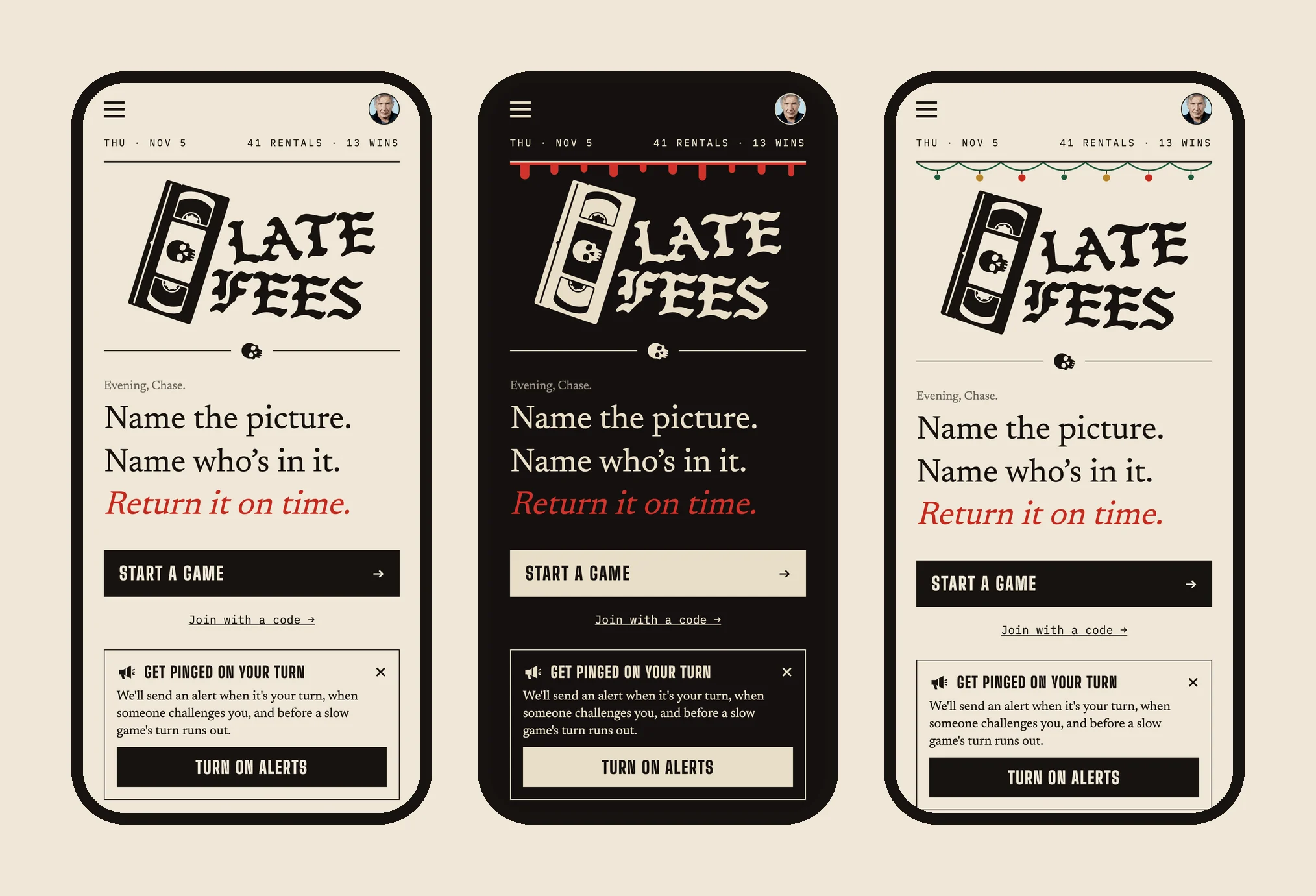
House Style was built to be re-printed. Seasons switch by date. Halloween's Midnight Screenings is the same layout printed at midnight, with bone ink on near-black and blood dripping off the masthead rule. December's Garland hangs ornaments off the masthead and turns the red labels evergreen. One rule was non-negotiable: a seasonal look can never leave anyone stuck in it.
The wow layer
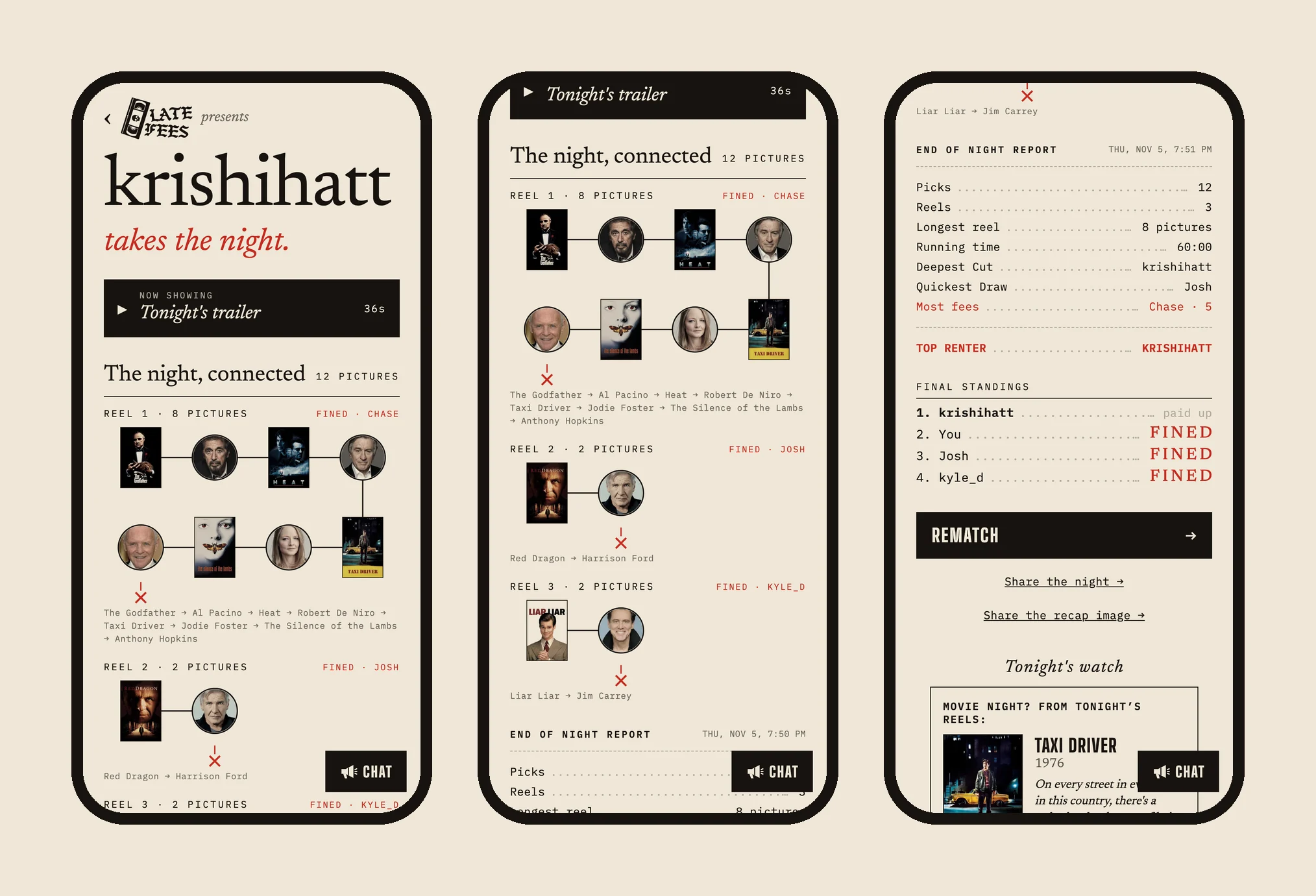
A finished game should be something people screenshot and bring up at work on Monday. So the end of every night became an event.
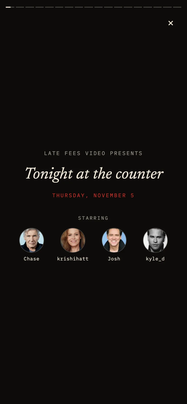
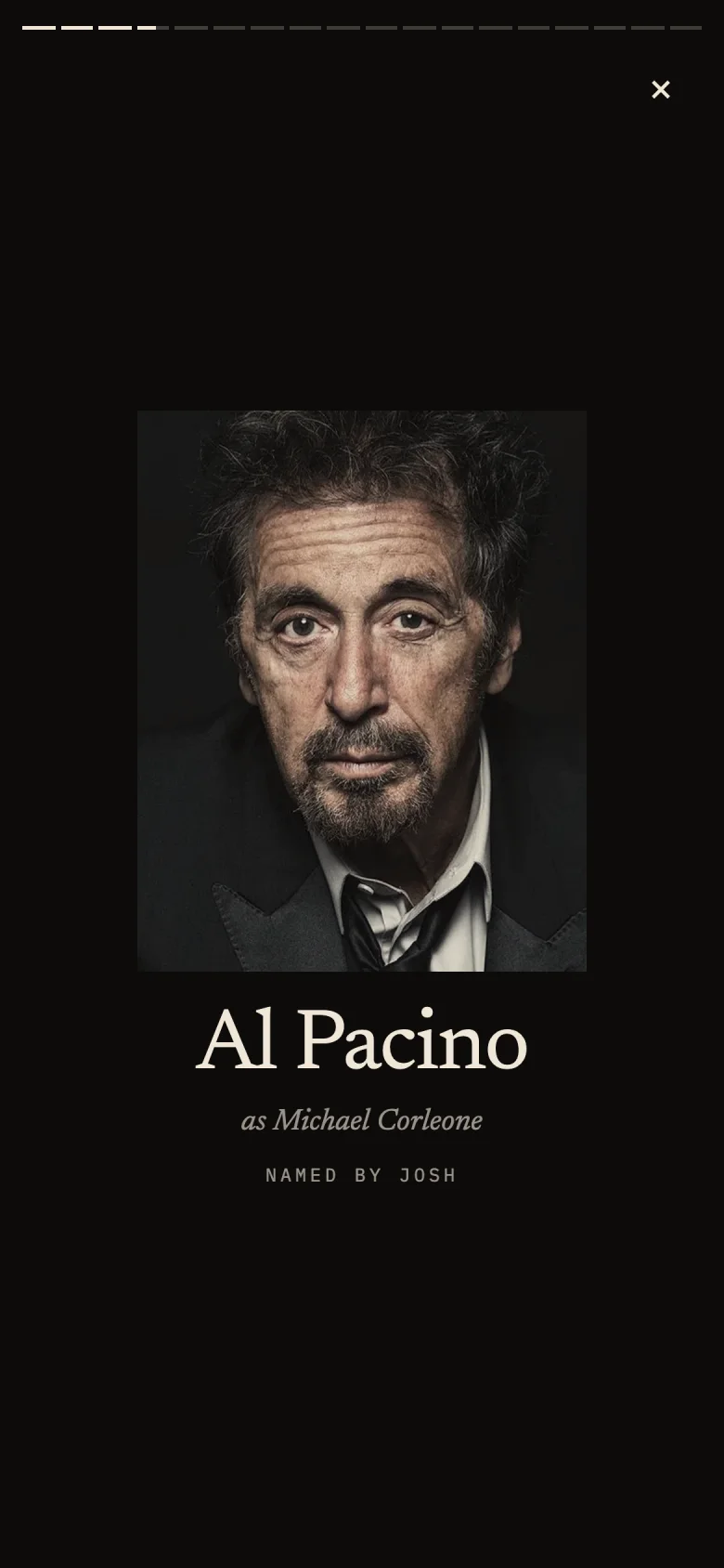
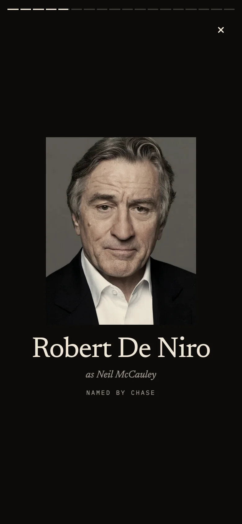
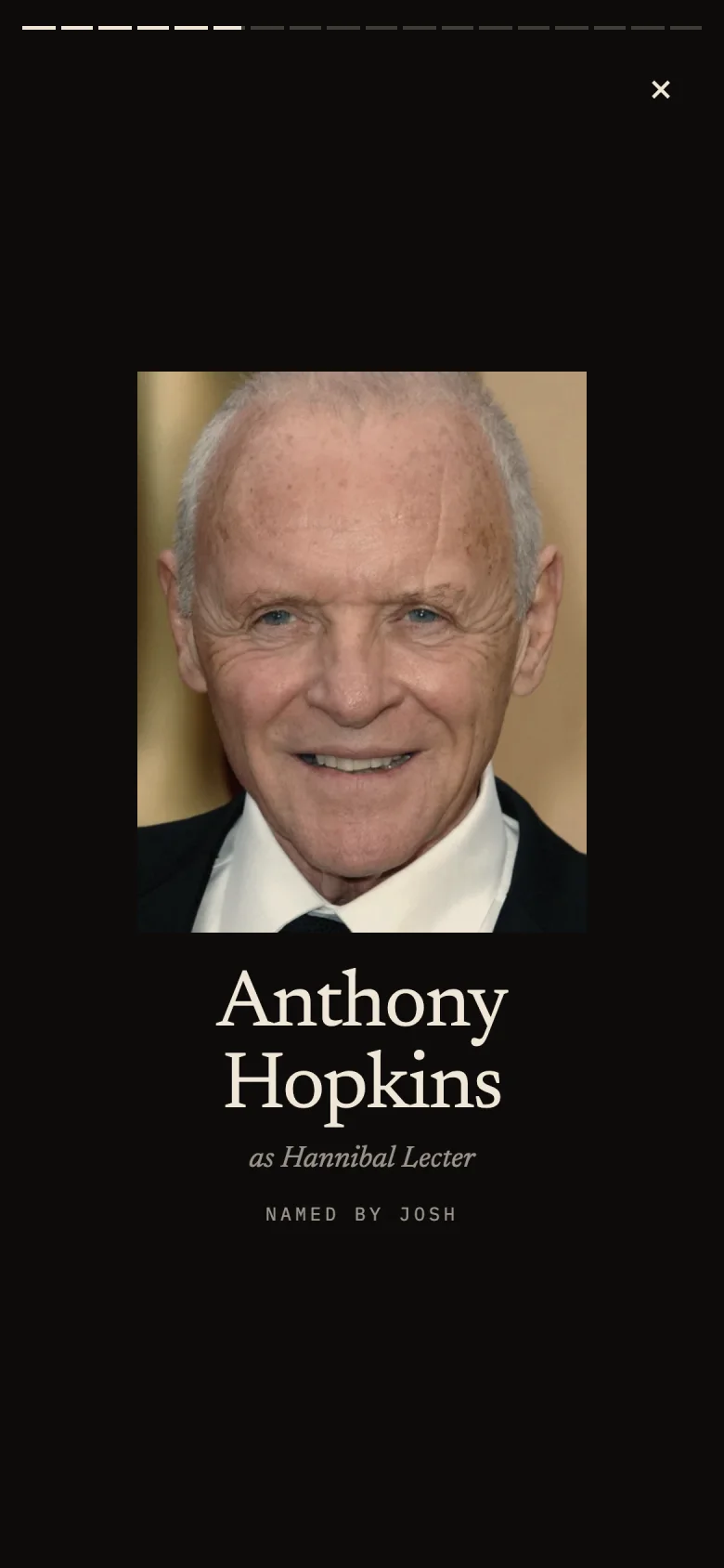
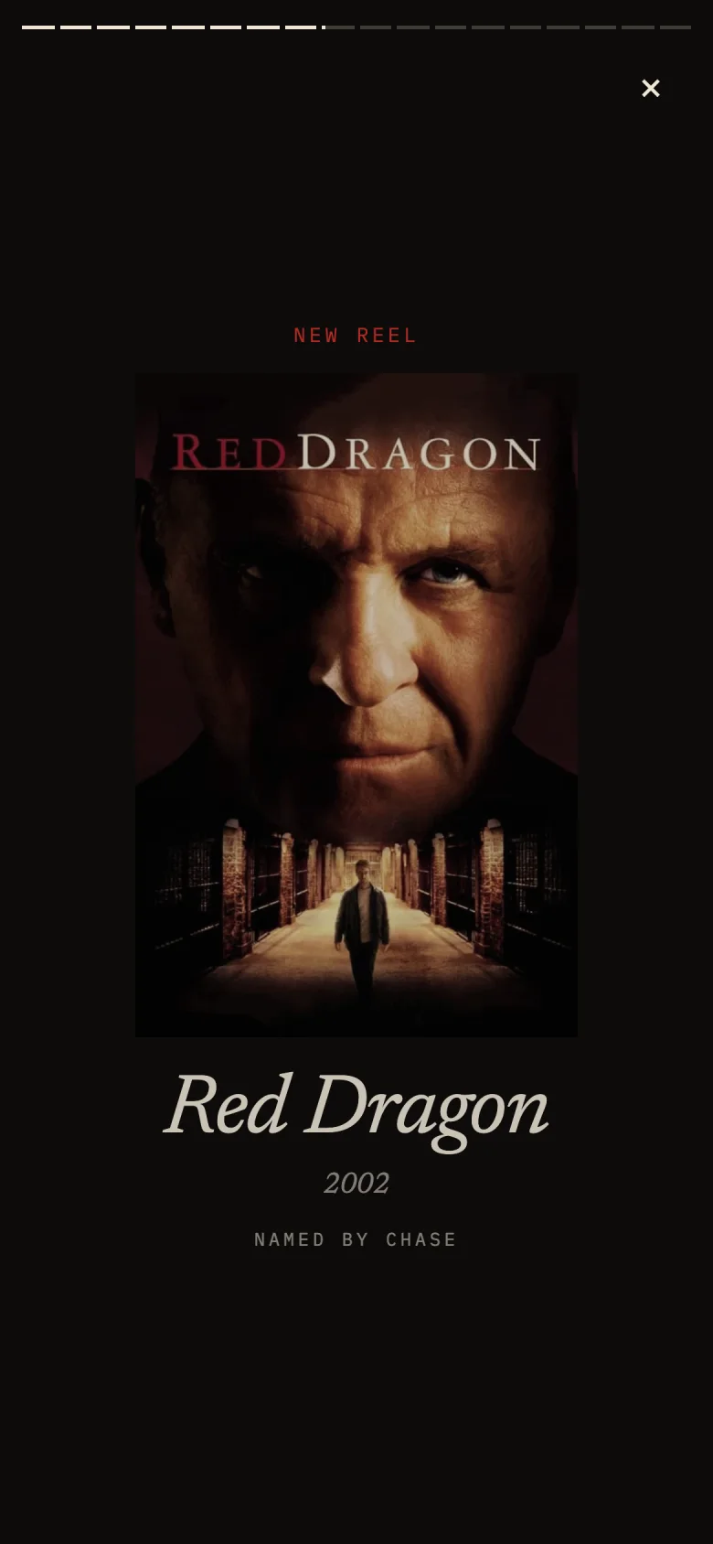
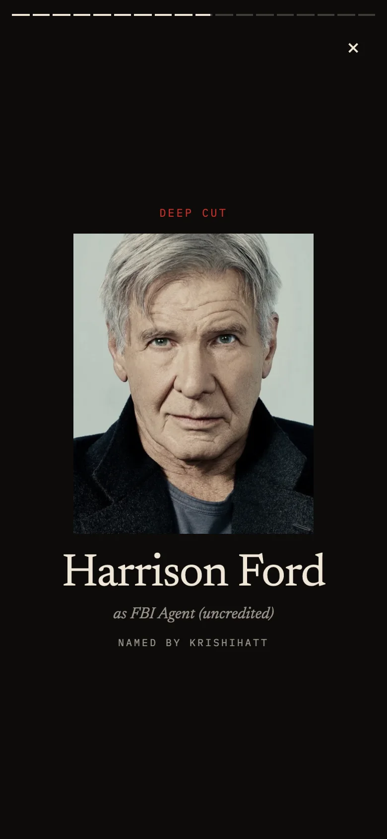
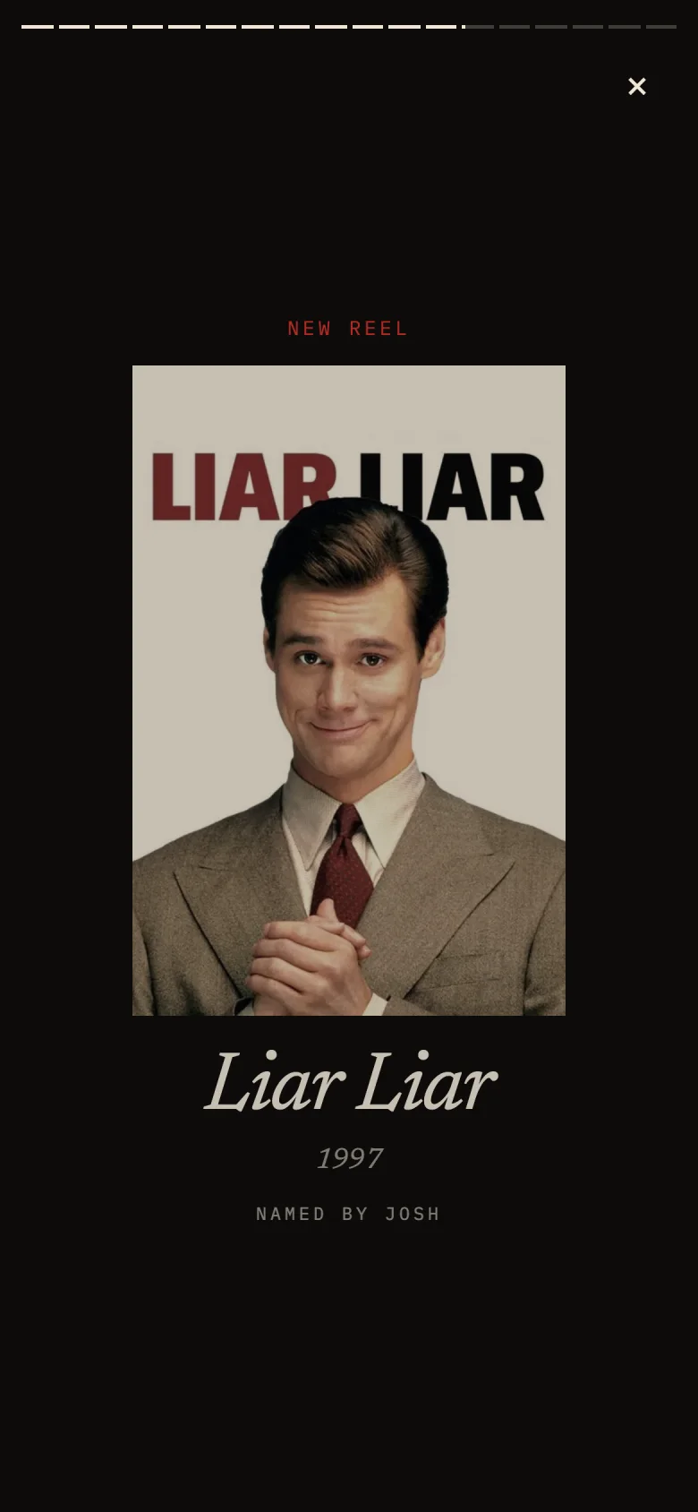
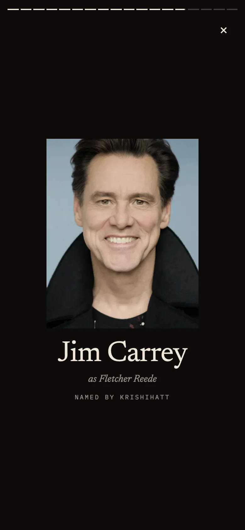
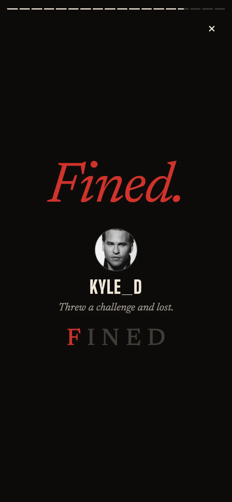
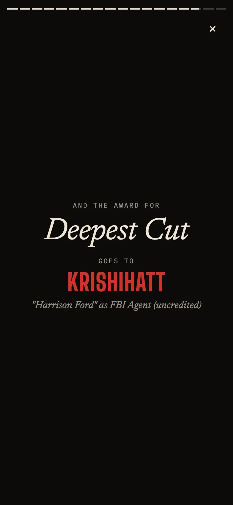
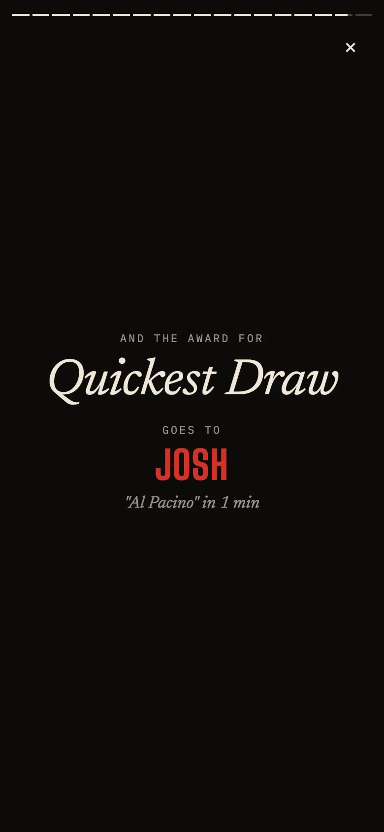
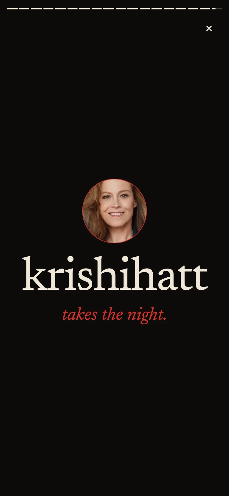
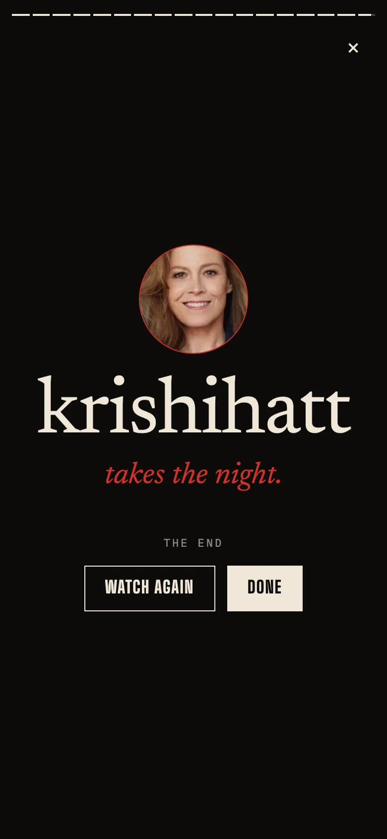
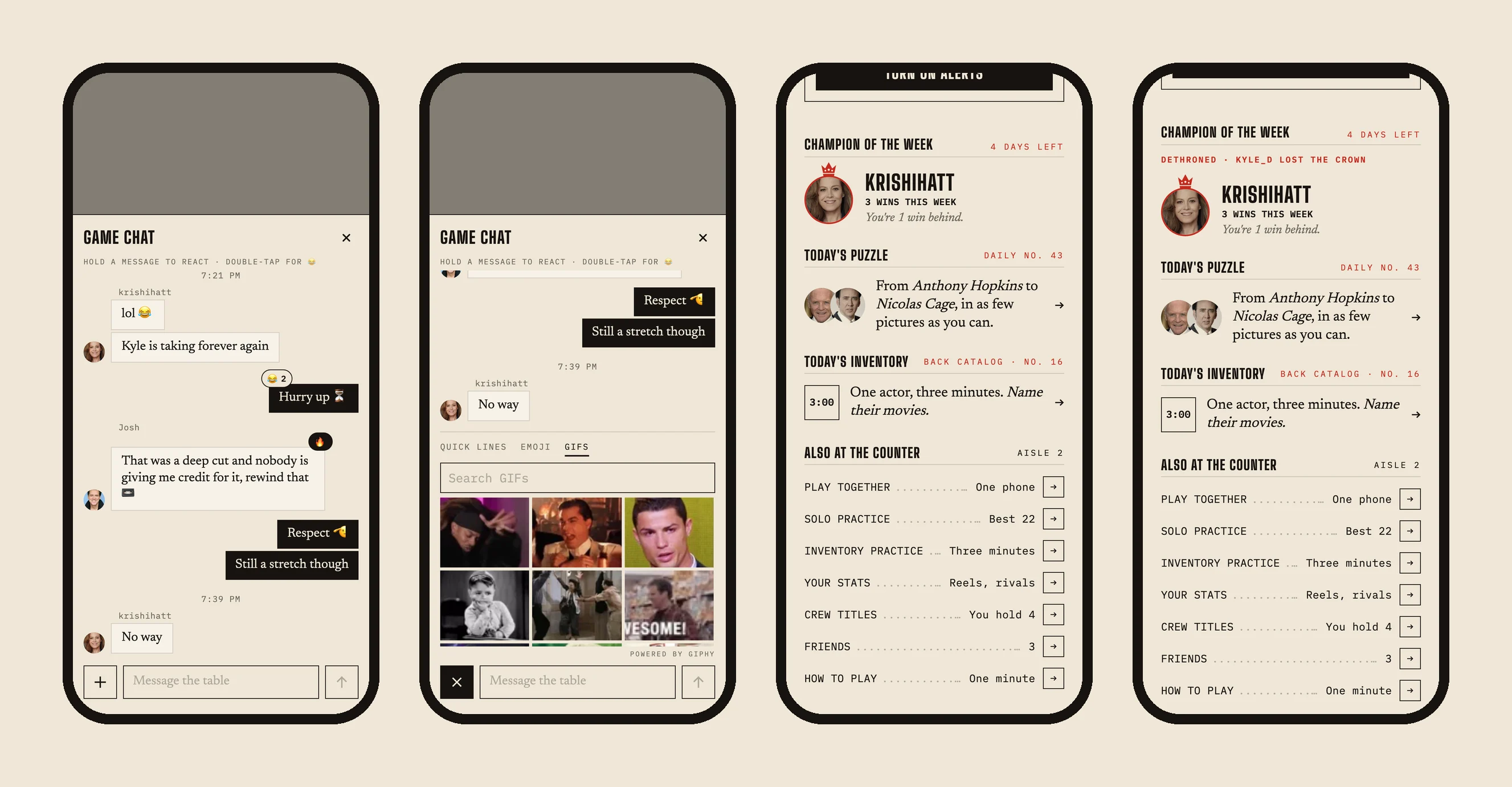
The night, connected draws every reel on the Winner screen as a winding map. Posters are squares and faces are circles, joined by lines, with a red ✕ and "FINED · NAME" where each reel broke. Hot streaks set a player on fire after three quick answers in a row. Champion of the week crowns whoever in your crew has the most wins since Monday. When the crown changes hands, the Hub says so: "DETHRONED · KYLE_D LOST THE CROWN."
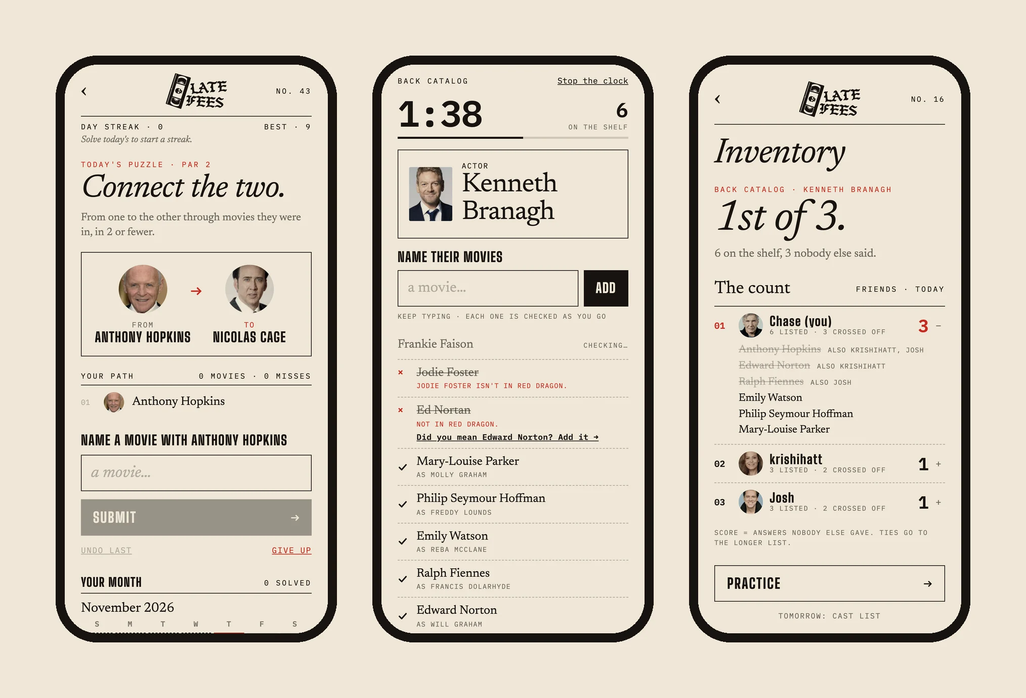
Reasons to come back on a Tuesday
Game night is weekly. The product needed a reason to open it in between. The Daily Challenge asks you to connect two household-name actors in as few pictures as possible. It has 366 pre-generated puzzles, par, streaks, a friends board and an emoji share grid, and every October day is a horror puzzle. Inventory (a friend's idea) gives you three minutes to name a movie's whole cast; you score only what nobody else in your crew said. Game chat works like a real group chat, with reactions, quick lines and GIF search (853 messages and counting).
Directing an AI engineering partner
Late Fees is also an experiment in a new way of building: one designer, at production quality. I set the product direction, designed every screen and system, wrote the voice, and made the calls. Claude Code wrote and tested the code. Speed wasn't the hard part. The hard part was keeping the work trustworthy, so I designed guardrails the way I'd design any system:
- A living project guide holds the rules that are easy to break: never say "chain," never break the signed-out front page, sign-in must stay a pop-up. Every session starts from the same truth.
- Custom review agents: a rules-checker reviews every change against that guide, a design-reviewer screenshots screens at phone size in every theme, and an answer-auditor turns the miss log into test cases.
- A preview harness renders any screen, in any state and season, with sample data and no sign-in. It made the design reviews, the release screenshots and every image on this page possible.
- Safety nets: a typecheck, 178 offline tests and a headless-browser start-up check run before every deploy. The same check runs against the live site after every deploy. Feature flags let new features ship dark.
Real-world constraints, designed for
Some of the most careful UX work is invisible. On an iPhone, tapping an invite link always opens Safari, never the installed app, and the two keep separate logins. So invites carry a Copy code button, Join has a Paste button, and the home-screen app adopts any game your account joined in Safari. iOS allows web push only after Add to Home Screen, so the app has a guided install flow, a "Check my alerts" self-test, and email backup for slow games. iOS never refreshes a home-screen icon, so the redesign shipped with a walkthrough for removing and re-adding the app. And when the product moved to latefees.app, I kept the old domain alive without a redirect, because friends' installed apps and logins were tied to it.
Impact
- Shipped a real product, not a prototype: a live, installable multiplayer game with sign-in, push alerts, a TV mode and three seasonal identities, built in about six weeks and played weekly by a real crew
- 102 games, 853 chat messages and a 52-pick record reel from 28 players, with friends returning between game nights for the Daily Challenge and Inventory
- Turned disputes into a fairness system: "Did you mean…?", "That counts!" and the miss log turned the game's biggest source of friction into a system that improves itself, with every confirmed matching gap locked in as a permanent test
- Redesigned a live product without breaking it: a role-based theme engine restyled about 20 screens automatically while I hand-drew the 13 that matter most
- Earned Google's sign-in branding approval through privacy, terms, account deletion and a public front page
- Proved out an AI-native workflow: one designer directing an AI engineering partner at production quality, with agents, guardrails and automated verification
Deliverables
- Product strategy, roadmap and phased releases, from POC to a live product
- Brand identity: name, VHS-skull logo, video-store voice and complete vocabulary
- House Style design system: palette, type system, layout rules and a role-based theme engine
- Seasonal theming system (Regular, Halloween, Holiday)
- 13 hand-designed core screens plus about 20 system-styled screens
- Game and interaction design: the fairness system, challenge economy, catch-up mechanics and pacing
- UX writing for every screen, rule and error
- Release assets: app icon, link previews, What's New and Field Guide pages
- Playtest program, miss-log audits and QA guardrails
Screens are rendered from the live product with real movie data and sample game states. Try it at latefees.app.