HCA Maternal Navigation App
Guiding expectant mothers through a clear, supportive digital care journey.
Overview
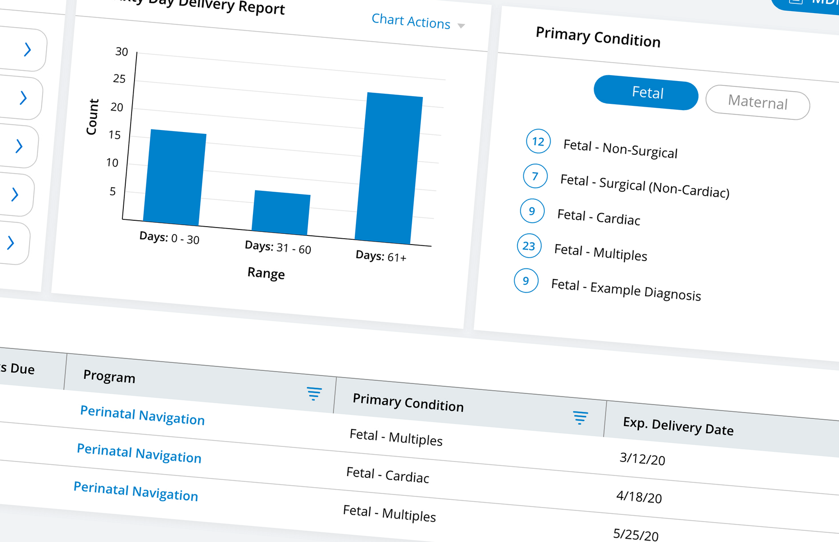
I led UX design for a maternal navigation application built for HCA Healthcare on the Pegasystems platform, created to improve the pregnancy journey for patients while giving nurses a powerful tool to coordinate care, share resources, and track progress. While the app was designed around patient needs, its primary users were nurses who guided mothers through every step of the journey — from first appointment to delivery. The goal was to help care teams manage cases more effectively, reduce risk, and improve outcomes through smarter coordination and clearer communication.
Challenge
Maternal care can be fragmented, with patients navigating multiple appointments, paperwork, and providers across a large hospital system. HCA needed a centralized solution that streamlined the process for patients while equipping nurses with tools to simplify workflows, ensure compliance, and improve communication.
Process & Solution
Discovery. The process began with stakeholder alignment at HCA's Nashville headquarters, where I worked with IT and clinical leadership to define goals, technical parameters, and known pain points in maternal care coordination. From there, I spent time on-site at The Women's Hospital of Texas, observing workflows and interviewing OB-GYNs, nurses, and administrative staff to understand how maternal care plays out day to day — from intake through delivery — and where technology could close the gaps.
The insight. The clearest finding to come out of that research was that maternal care isn't driven by individual tasks — it's driven by people, their stories, and their ongoing care journeys. In the existing workflow, tasks were siloed and surfaced generically, disconnected from the broader patient context, which made it hard for nurse navigators to track meaningful progress, anticipate needs, or engage with patients in a personalized way.
The shift. I made the call to restructure the application around the patient rather than the to-do list. Every major section — from the dashboard to the case view — was reoriented to answer:
- What's happening with this patient today?
- Who's involved in their care?
- Where are they in their maternal journey?
- What needs to happen next, and why?
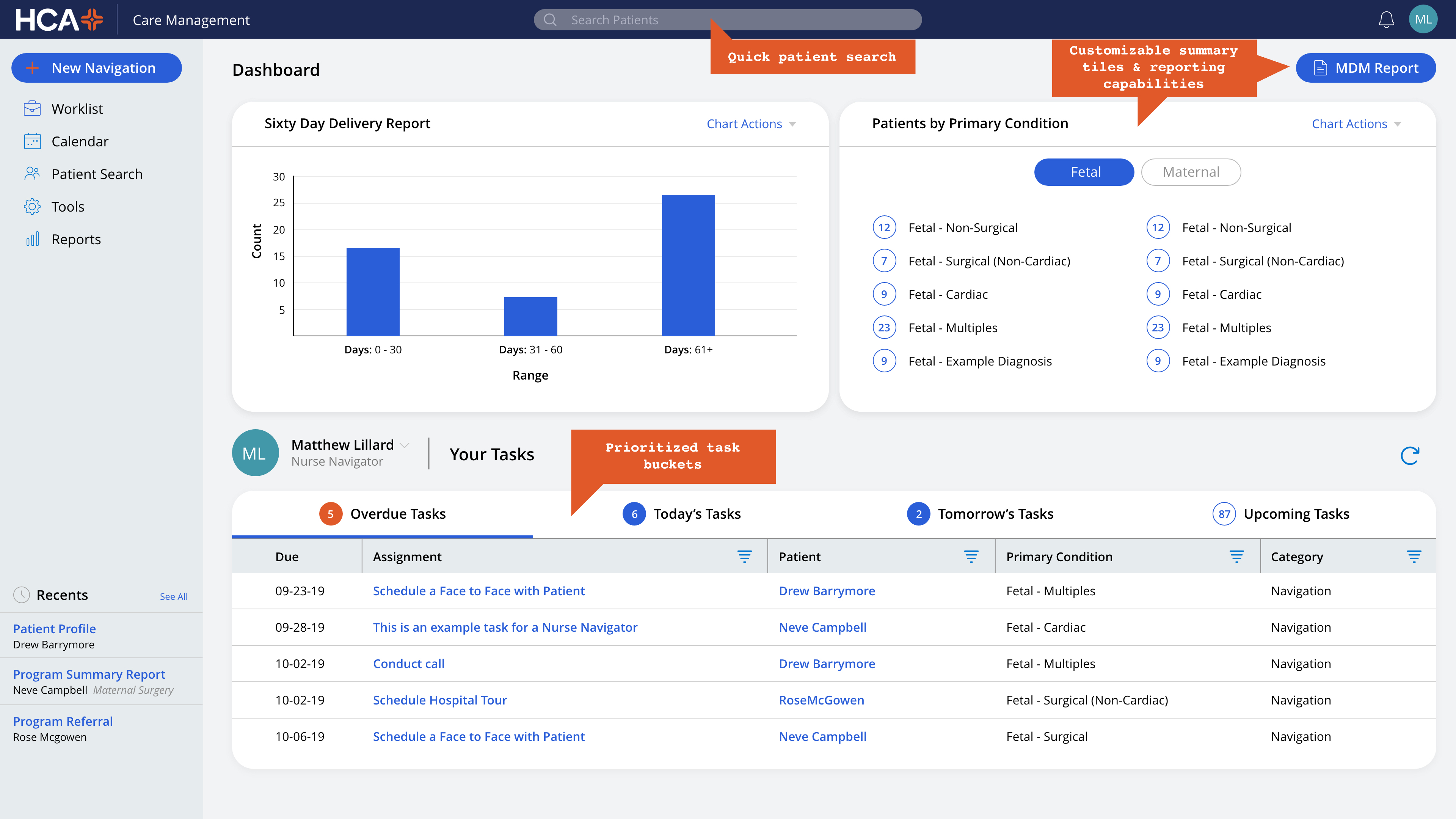
Anchoring navigation, tasks, and documentation to the patient profile and care phase let nurses focus on whole-person care instead of fragmented responsibilities — a decision that shaped everything from visual hierarchy to how filters, conditions, and case status were surfaced.
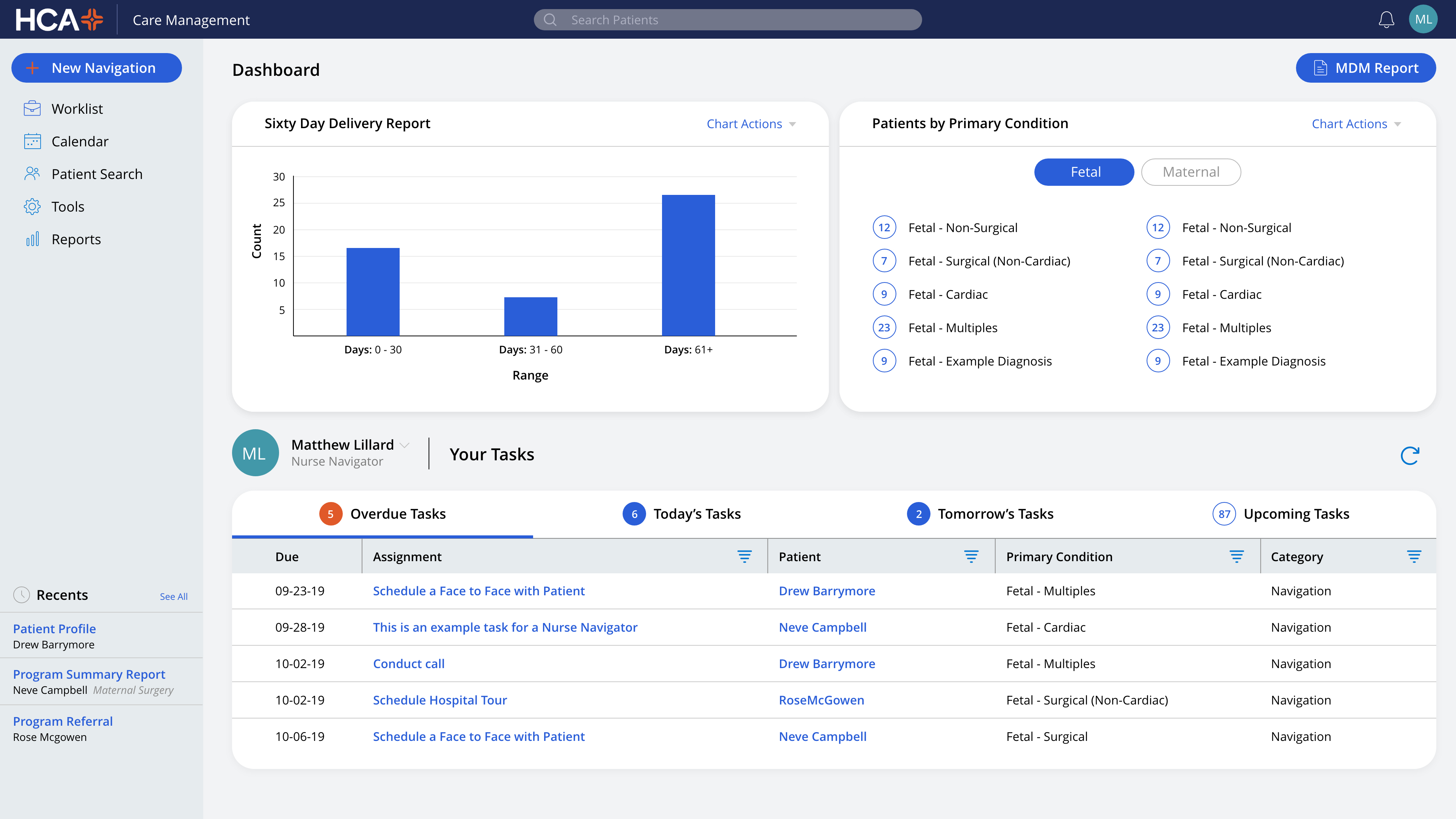
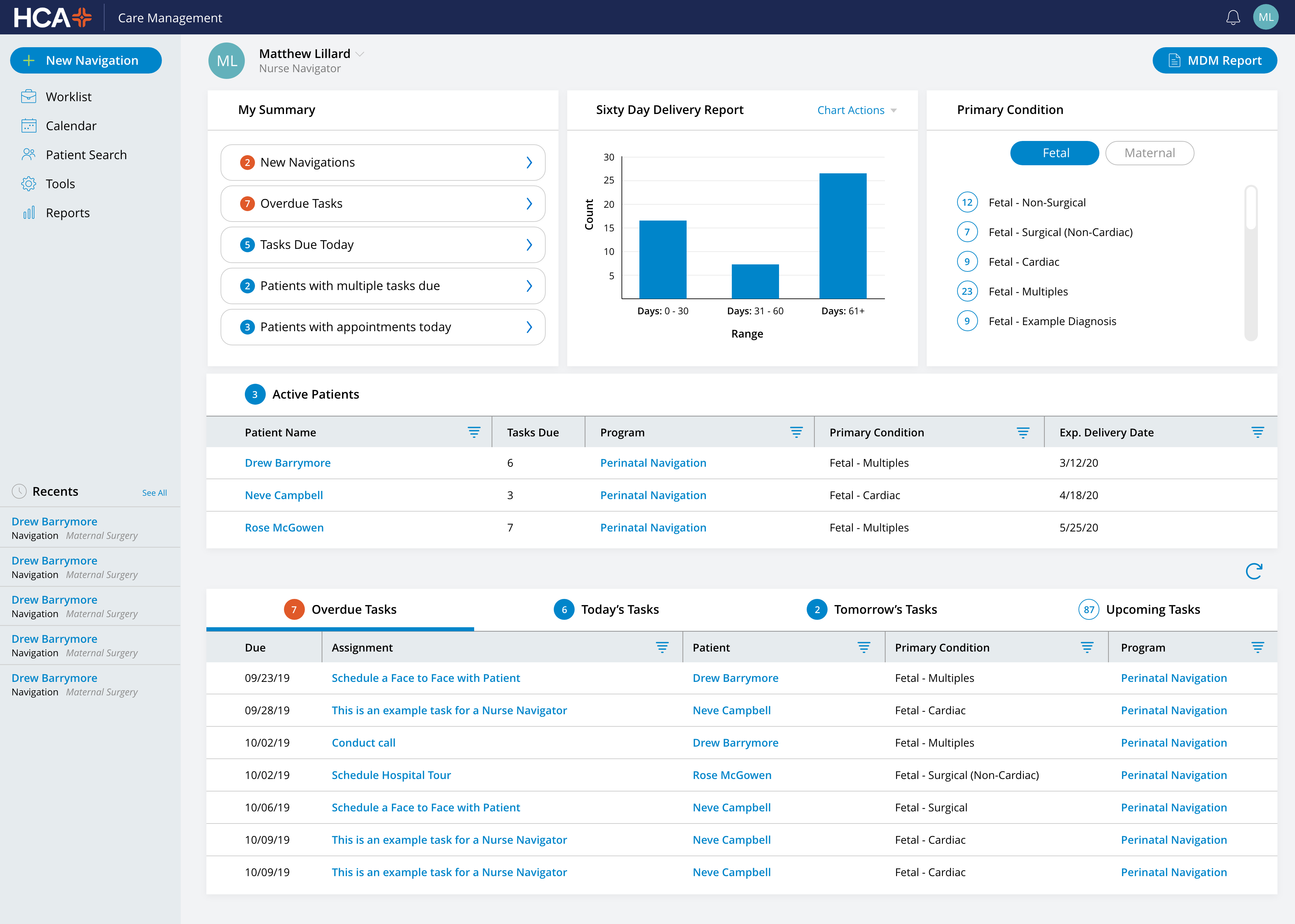
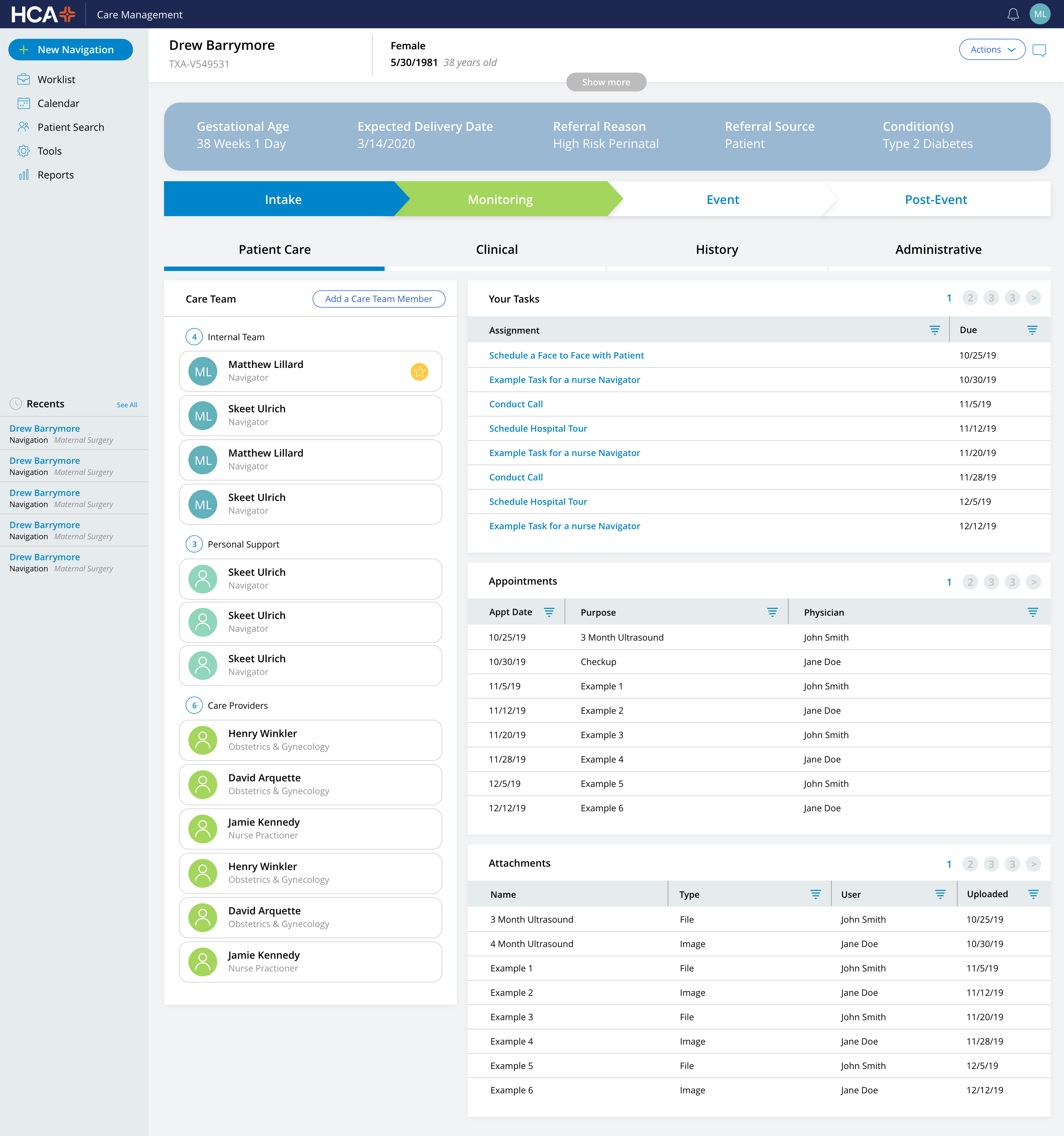
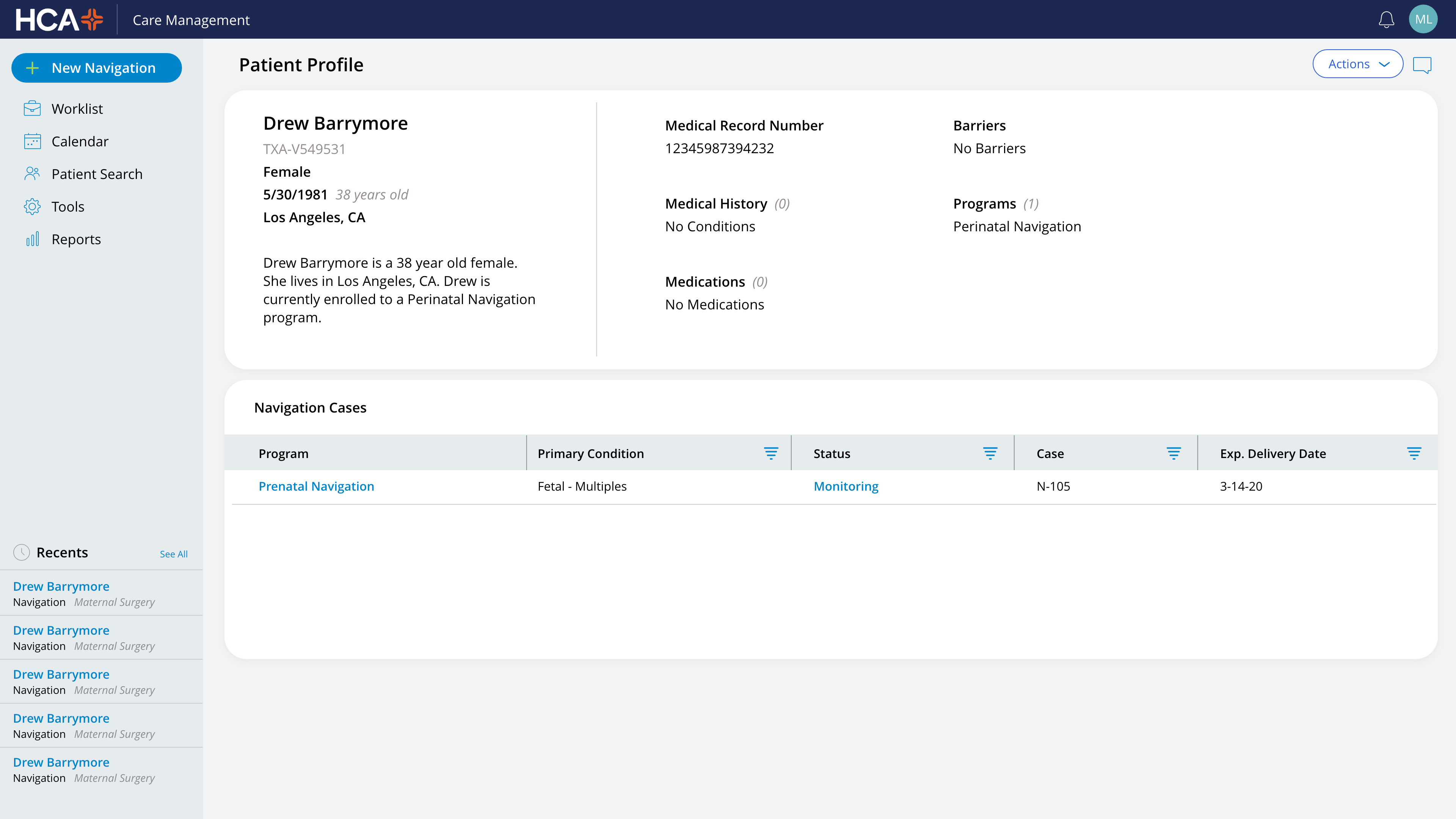
The build. Partnering with clinicians and Pega developers, and working within the constraints of Pega's model-driven development platform and HCA's enterprise design system, I designed structured pathways, reminders, and resource-sharing tools while keeping the patient's journey front and center. Two areas saw the biggest shift:
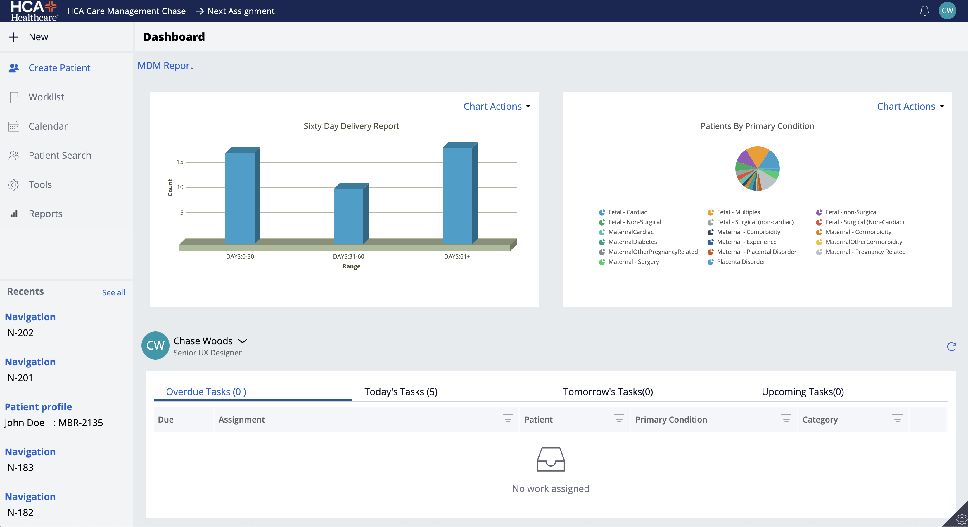
- Dashboard: Moved from a static data display to an actionable view with clearer task prioritization by day, at-a-glance visibility into patient loads and overdue tasks, and integrated search — helping navigators move from reactive workflows to proactive planning.
- Case view & patient profile: Reflected where each patient stood in their maternal journey (monitoring, event, etc.) and pulled together the care team, task and appointment history, and clinical documentation in one place, keeping clinicians and support staff aligned on the care plan.
Every element was designed for clarity, accessibility, and compassion, ensuring the experience supported care delivery without adding complexity.
Impact
- Reduced nurse record-management time by ~25%, freeing hours for direct patient care
- Cut cross-shift handoff time from ~10 minutes to ~3 minutes in pilot observations, a 70% gain in navigator productivity
- Increased task completion rates through streamlined workflows
- Improved early identification of high-risk cases, helping prevent costly escalations and readmissions
- Enhanced accessibility and compliance, ensuring broader usability
- 100% of pilot users chose to keep the new dashboard as their default home screen
"Chase helped us untangle a very complex healthcare system and turn it into an experience our staff and patients could actually use. His thoughtful design approach made a measurable difference in efficiency and confidence across our teams." — Lindsay McCormick, Maternal Navigation Nurse
Deliverables
- Onsite clinical observation and nurse interviews
- Journey maps for patient and nurse workflows
- Wireframes and interactive prototypes
- High-fidelity mobile app designs
- Accessibility and compliance reviews
Mockups shown reflect placeholder data and the design capabilities of the Pegasystems platform — no real patient information or production screens are included.